Same Deals, New Design
Save.ca is a Canadian coupon and flyer site established in 2000. It was time to give the site a bit of a refresh. Come take a look for yourself. 👋
Save.ca is a Canadian coupon and flyer site established in 2000. It was time to give the site a bit of a refresh. Come take a look for yourself. 👋

In recent years, coupons and flyers have become digitized and readily available online and in apps. With increased competition from international players, Save.ca was struggling to keep its market share.
The business goal was to increase user engagement and revenue opportunities.
Product Designer
Research, Wireframing, Visual Design & User Testing
5 months
Our research showed that the primary use of the site was for Previewing Flyers and Redeeming Coupons. Previewing flyers did not test well, and it was a pain point for users. Coupon Redemption was also a major source of revenue for Save.ca, however the drop off rate was high. We needed to rethink both these experiences to meet our business goal and solve our users problems.
1. Enhance flyer experience and navigation
2. Revise coupon redemption flow
Tight Timeline
Stakeholders wanted to launch new product as a sales initiative within 5 months. An agile workflow was required to keep all team members in production.
Backend Constraints
Limitations derived from a complicated backend pushed us to find creative UX solutions.
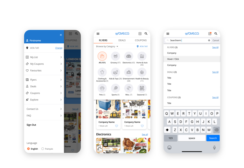
Data indicated users primarily accessed the site through their phones, and preferred to browse flyers and coupons. Therefore, all wireframes began with a mobile first approach. We first developed ‘browsing flyers’ and ‘coupon redemption’ flow, then flushed out the rest of the site using that as our foundation.

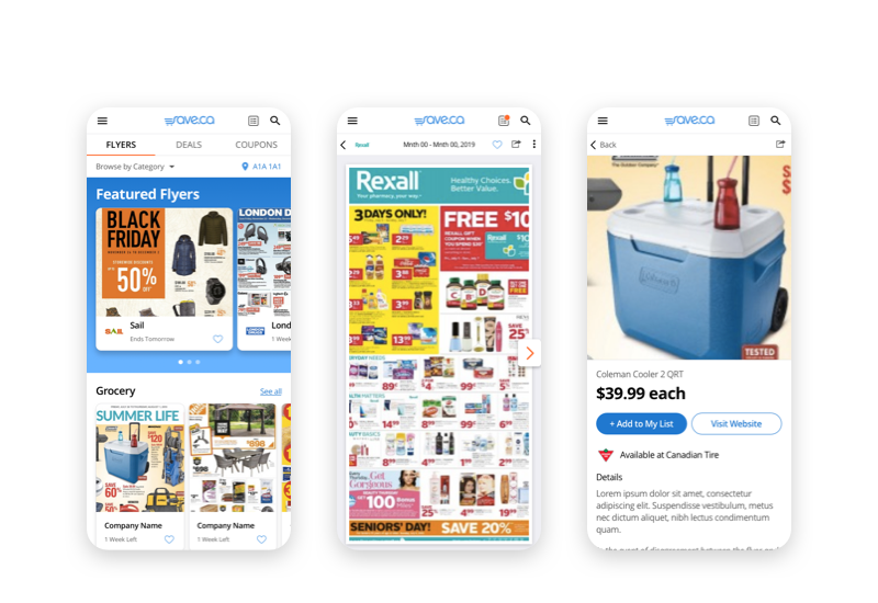
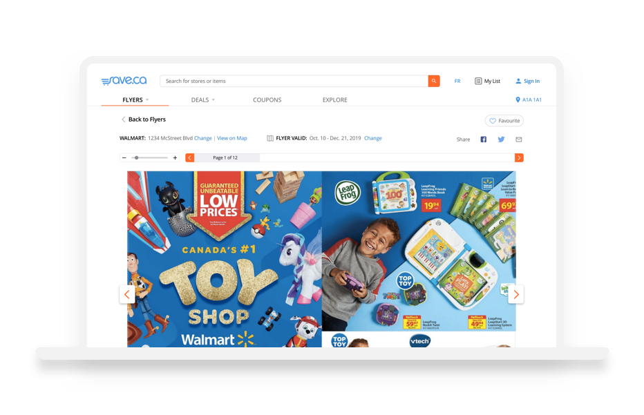
Browsing Flyers Flow: We discovered it wasn’t just the Flyer Preview page that was testing poorly, it was the overall experience. To solve this, we leveraged well-established e-com UX patterns to ease the learning curve for users.

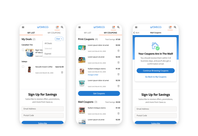
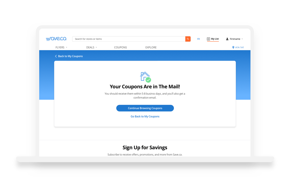
Coupon Redemption Flow: By far our biggest challenge was trying to integrate two types of coupon experiences (mail and print at home) into one. A lot of testing, revising and UX copy writing was put into this flow.
After our wireframes were flushed out and tested, we moved on to visual design. Starting with our root elements like grid, text styles and colour, we built out a design system using atomic design principals.
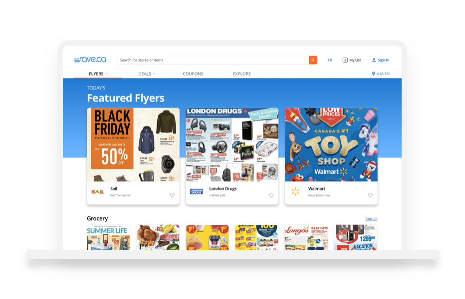
The site was built to be responsive within 3 breakpoints (mobile, tablet and desktop). Each breakpoint was assigned column number, margin and gutter based on an 8px grid.

Mobile | 4 column | 16px margin | 16px gutter

Tablet | 4 column | 24 margin | 16px gutter

Desktop | 12 column | 40px margin | 24px gutter | Max width 1100px
To improve visual hierarchy we added some supporting colours. UI elements like navigation and CTAs were designed with high contrast in order to pass accessibility standards and have a minimum WCAG AA certification.


Open Sans is a humanist sans-serif typeface that is modern and very web friendly.

‘Action’ icons were inspired by Material Design. All icons were 24px and came in small or large formats.

Final tests were done on high-fidelity, interactive prototypes hosted on Invision. Testing was conducted through usertesting.com, our candidates were male and female between 25-40 who regularly use coupon apps and/or websites. Testing was conducted on mobile and desktop. Results were positive, and designs were modified based on feedback.

Checkout Flow Before: Confusing and poor information architecture

Checkout Flow After: Visibility of coupon types, and simple 2-click order.